Nov 13, 2025 · 13 min read
Data Visualization: Turning Data into Insights
What is Data Visualization?
Data visualization is the practice of turning raw data into visual formats such as charts, graphs, maps, dashboards, or infographics so that information is easier to understand.
By representing complex numbers and relationships visually, data visualization helps people see patterns, trends, and outliers that might be missed in text or spreadsheets. A well designed chart can communicate the main message at a glance.
Modern tools support both static images and interactive visuals. Interactive dashboards let users filter, drill down, and explore data in real time. In this way, data visualization sits at the intersection of analysis and design. It combines clear reasoning with thoughtful visuals to communicate data driven insights effectively.
Why is Data Visualization Important?
In a data driven world, organizations collect huge amounts of information from websites, apps, sensors, social media, and internal systems. Simply having data is not enough. Decision makers need to understand it.
This is where data visualization adds value:
-
Simplifying complexity
Visuals break large or complex datasets into clear shapes and colors. It is much easier to interpret a heat map or bar chart than thousands of rows in a table. -
Revealing patterns and trends
Our brains are very good at spotting visual patterns. Charts make relationships obvious, such as seasonality in revenue or a correlation between two variables. A simple line graph can reveal a clear trend that would be hard to see in raw numbers. -
Saving time
Visuals deliver information at a glance. A chart that shows ten years of profit on a single axis is far faster to understand than reading a decade of reports. -
Improving communication
Data visualizations help non technical and technical audiences meet in the middle. A clear chart or dashboard lets everyone see the same picture, which makes discussions and decisions easier. -
Supporting better decisions
When important signals are easy to see, teams can act faster. Visualizations highlight what matters, so organizations can spot opportunities, identify risks, and adjust strategy before problems grow.
Almost every industry benefits from effective data visualization. It turns data from something abstract into something useful that people across the organization can actually work with.
What are the Benefits of Data Visualization?
Beyond general importance, data visualization delivers specific, practical benefits in business and research.
-
Faster strategic decisions
Leaders can interpret complex information quickly, which speeds up planning and execution. Dashboards help them see trends, anomalies, and thresholds early so they can respond in time. -
Better customer insight
Visual analysis can show customer behavior, preferences, and pain points clearly. For example, charts of support tickets by category can highlight common issues and guide product or service improvements. -
Higher employee engagement
When teams see progress toward goals in visual form, it becomes easier to stay aligned. Shared dashboards and KPI boards give everyone a clear view of what matters and how they contribute. -
Clearer communication of findings
Visuals are a universal language. They help analysts present results to stakeholders without getting lost in technical details. This reduces misunderstanding and encourages data informed conversations.
In short, data visualization turns data into a story that people can see, remember, and act on.
Key Components of Data Visualization
Good data visualization is not just about drawing a chart. It brings together three core components:
-
The story (purpose)
Every visualization should answer a question or support a decision. For example, you might ask, "Which product category grew fastest this quarter?" or "How does website traffic relate to signups?" A clear question keeps the visualization focused. -
The data
Once the goal is defined, you need relevant, reliable data. This includes selecting the right sources, cleaning errors, handling missing values, and structuring data so it can be analyzed properly. Weak data leads to weak visuals. -
The visual
Finally, you choose how to represent the data. This includes chart type, layout, colors, labels, and emphasis. The visual should match the story. For instance, a trend over time fits a line chart, while parts of a whole may fit a stacked bar or pie chart.
Strong visualizations always start with the question, then the data, then the design. Skipping any one of these steps reduces clarity and impact.
The Data Visualization Process
Creating a meaningful visualization usually follows a simple, repeatable process:
-
Define the goal or question
Be clear about what you want to understand or explain. For example, "Which marketing channels drive the most profitable customers?" This goal shapes every other step. -
Collect relevant data
Gather the data needed to answer the question. This might come from databases, analytics tools, surveys, or external sources. Focus on what is truly relevant. -
Clean and prepare the data
Remove duplicates, fix errors, handle missing values, and filter out noise. You may also create new fields or metrics. The aim is a clean dataset that reflects reality as accurately as possible. -
Choose the right visual format
Match the chart type to the nature of the data and the insight you want to highlight.- Compare categories: bar chart
- Show trends over time: line or area chart
- Show distribution: histogram or box plot
- Show relationships: scatter plot
For more complex questions, you may need multiple visuals or an interactive dashboard.
-
Create and refine the visualization
Build the chart or dashboard in your chosen tool. Use good design practices: clear titles, readable labels, sensible colors, and minimal clutter. Test it with others, gather feedback, and refine until the message is clear.
Following this process makes your visualizations more consistent, more efficient to build, and more trustworthy.
Types of Data Visualization Techniques
There are many ways to visualize data. Choosing the right approach depends on your data type and the story you want to tell.
Common visualization formats
These are the visuals most people see every day:
-
Charts and graphs
Bar charts, line graphs, pie charts, scatter plots, histograms, and similar visuals. They help compare quantities, show trends, reveal distributions, and highlight relationships. -
Maps
Used for geographic or spatial data. Examples include choropleth maps (regions shaded by value), point maps (locations plotted on a map), and density maps. Maps are ideal when location matters. -
Tables
Grids of numbers or text. Tables are best for precise lookups or when exact values are important. They can be enhanced with color to make patterns easier to see. -
Infographics
A combination of charts, icons, and text on a single canvas. Infographics tell a compact story, often for wider audiences or external communication. -
Dashboards
Collections of multiple visuals on one screen. Dashboards are usually interactive and are used to monitor key metrics and explore related data.
Visualization categories
You can also group visualization techniques by the structure of the data they show:
-
Temporal visualizations
Used for data over time. Examples: line charts, area charts, timelines. These are ideal for trends, seasonality, and change. -
Hierarchical visualizations
Used when data has parent child relationships. Examples: tree diagrams, treemaps, dendrograms, organizational charts. -
Network or relational visualizations
Used to show connections between entities. Examples: node link diagrams, social network graphs, relationship maps. Scatter plots and bubble charts can also show relationships between variables. -
Multidimensional visualizations
Used when there are many variables. Examples: grouped bar charts, bubble charts with size and color, radar charts, parallel coordinates. These charts help compare several factors at once. -
Geospatial visualizations
Used when location is important. Examples: heat maps, choropleth maps, cartograms. These visuals show how a measure varies across regions.
These categories often overlap. For example, a geospatial visualization can also be temporal if you show change over time. The key is to choose a form that makes the core insight obvious.
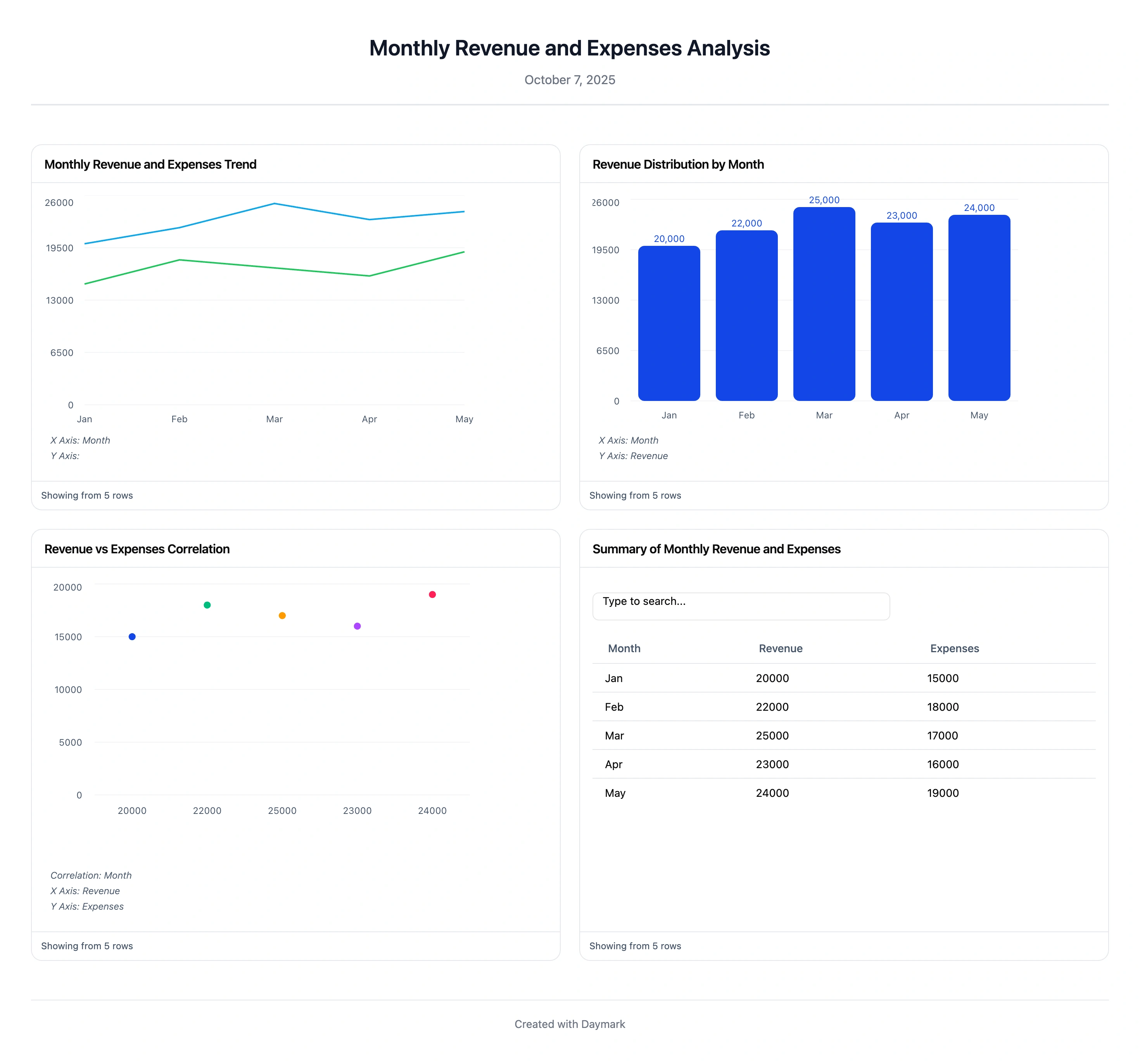
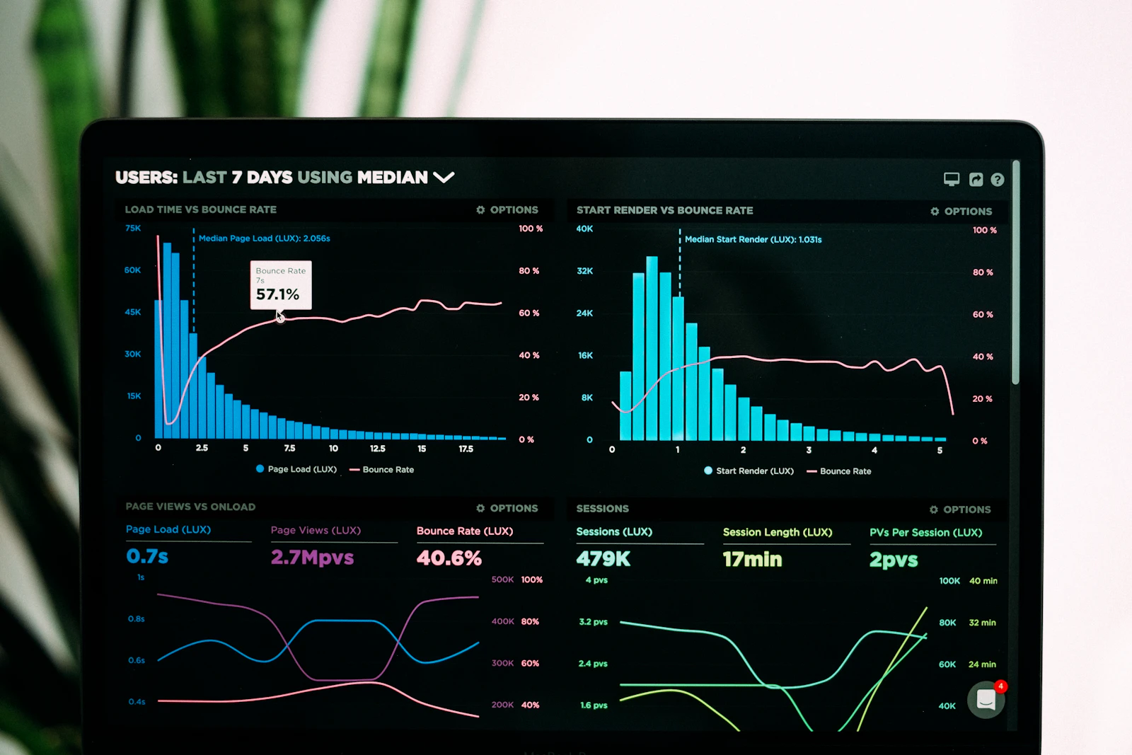
Data Visualization Dashboards
Dashboards are a special and very practical category of data visualization. They bring multiple charts, numbers, and metrics together in one place so users can monitor performance and explore data.
For example, a sales dashboard might include:
- A line chart of revenue over time
- A bar chart of sales by region
- A table of top products
- A gauge or card for monthly target progress
Dashboards are often interactive. Users can filter by date, segment, or region, or drill into specific areas for more detail. Most dashboards connect directly to live data so they update automatically.
Common tools for building dashboards include platforms such as Tableau, Microsoft Power BI, Looker Studio, and AWS QuickSight. These tools make it easy to share dashboards across teams.
The main risk with dashboards is overcrowding. The best ones:
- Focus on a small number of important metrics
- Use a clean layout
- Highlight exceptions or important changes clearly
Used well, dashboards provide at a glance situational awareness and act as a starting point for deeper analysis.
Real World Use Cases for Data Visualization
Data visualization is used across almost every industry. Here are some examples of how it helps in practice:
-
Business and finance
Companies track KPIs such as revenue, profit, and costs with charts and dashboards. Financial analysts use time series charts to monitor markets and make investment decisions. -
Healthcare
Hospitals and public health agencies use charts and maps to track patient volumes, treatment outcomes, and disease spread. Visualizations help them spot spikes, allocate resources, and evaluate interventions. -
Retail and ecommerce
Retailers use visual dashboards to understand product performance, customer segments, and regional trends. Web heat maps and funnel charts reveal how users move through online stores and where they drop off. -
Sports analytics
Teams use shot charts, heat maps of player movement, and performance dashboards to optimize tactics and training. Visuals help coaches and analysts explain strategies to players and management. -
Government and public policy
Governments visualize census results, budgets, crime statistics, and election outcomes to make information accessible to citizens and policymakers. -
Science and research
Researchers rely on visualizations to explore and present experimental results. From gene expression plots to survey result charts, visuals make complex findings easier to interpret and share.
In every case, the goal is the same: turn data into insight that supports better decisions.
What Makes a Good Visualization
Not all charts are effective. A good data visualization communicates information clearly, accurately, and with minimal effort from the viewer.
Here are key principles:
-
Know your audience
Match the level of detail and technical language to who will use the visual. An executive summary chart should be simple and high level. A chart for analysts can go deeper into detail. -
Choose the right chart type
Align the visual with the story. Use line charts for time, bar charts for comparisons, scatter plots for relationships, and so on. Avoid using chart types in ways that confuse the viewer. -
Simplify and focus
Remove anything that does not help understanding. Avoid unnecessary decoration, 3D effects, or too many colors. Use emphasis sparingly to highlight key points. -
Provide context and labels
Make sure titles, axes, units, and legends are clear. Add notes or annotations for important events or anomalies. If helpful, include reference lines such as targets or averages. -
Design for usability and accessibility
Ensure text is readable, colors have enough contrast, and color choices are friendly for people with color vision deficiencies. If the visualization is interactive, keep interactions simple and intuitive. -
Stay accurate and honest
Do not distort the data. Be careful with axis scales, proportions, and sampling. If there is uncertainty or a margin of error, communicate it.
A visualization is successful when the intended audience can quickly understand the key insight and feel confident about what the data is saying.
Tools and Software for Data Visualization
There are many tools for data visualization, from simple chart builders to full business intelligence platforms. The right choice depends on your skills, data sources, and use case.
Business intelligence and dashboard tools
These tools focus on interactive dashboards and are usually friendly for non developers:
-
Tableau
Widely used for rich, interactive dashboards and advanced visuals. Connects to many data sources and is suitable for business users and analysts. -
Microsoft Power BI
Integrates tightly with the Microsoft ecosystem. Good balance of power, cost, and usability. Often used across whole organizations. -
Google Looker Studio (formerly Data Studio)
Free and browser based. Great for marketing and web analytics, especially if you use Google Analytics, Ads, or YouTube. -
Qlik Sense, IBM Cognos and others
Enterprise focused BI platforms that support large scale reporting and dashboarding needs.
These tools typically offer drag and drop interfaces, built in connectors, role based access control, and easy sharing.
Open source libraries and programming tools
For developers and technical users, code based libraries offer deep flexibility:
- JavaScript: D3.js, Chart.js, ECharts, Vega and Vega Lite
- Python: Matplotlib, Seaborn, Plotly, Altair
- R: ggplot2 and other packages in the tidyverse
These libraries are ideal when you need custom visuals, integration with web applications, or advanced analytics. They are usually free and open source but require programming knowledge.
Specialized or domain specific tools
Some tools are tailored to specific types of data:
- Geospatial: ArcGIS, QGIS for mapping and spatial analysis
- Network graphs: Gephi, Neo4j Bloom for relationships and graph data
- Timelines and storytelling: TimelineJS and similar tools
When choosing a tool, consider:
| Criteria | Description |
|---|---|
| Integration with data sources | Check that the tool connects easily to your databases, files, or cloud services. The easier it is to get data in, the more likely people will use it. |
| Interactive capabilities | Modern users expect filters, drill downs, and tooltips. If exploration is important for your use case, prioritize tools that support rich interactivity without heavy coding. |
| Security and sharing | Look at how the tool handles user permissions, data privacy, and sharing options such as public links, private embeds, or internal portals. Choose a setup that matches your security and compliance needs. |
| Scalability and performance | As data volume grows, the tool should remain responsive. Cloud or enterprise tools often handle large datasets better than desktop only tools. |
| Cost and licensing | Open source libraries like D3.js and many Python or R packages are free but require development effort. Commercial tools charge license fees but save time with easier setup, support, and user friendly interfaces. Evaluate the full cost, not just licenses. |
Beginners often start with spreadsheet tools or an easy BI platform. More advanced users may combine BI tools with code based libraries to get the best of both worlds.
Conclusion
Data visualization bridges the gap between raw numbers and real understanding. It turns data into something you can see, explore, and act on.
Whether you want to:
- Track business performance
- Understand customer behavior
- Explain research findings
- Monitor operations in real time
visualizations and dashboards help you move from noise to clarity.
As you build your own visuals, focus on three ideas: purpose, honesty, and clarity. Choose charts that match the story, design them so they are easy to read, and let the data speak for itself.
With modern tools and platforms like Daymark, it is now possible for almost anyone to move from raw data to useful visual insights in minutes. Start simple, iterate often, and let your charts tell the stories your spreadsheets cannot.
Frequently Asked Questions (FAQs)
What is data visualization?
It’s the practice of transforming raw data into visual forms charts, graphs, maps, dashboards so people can quickly understand patterns, trends, and outliers and make better decisions.
Why is data visualization important?
Visuals simplify complex data, reveal patterns, save analysis time, and improve communication across technical and non-technical audiences leading to faster, more confident decisions.
How do I choose the right chart type?
Match the chart to the relationship: bars for comparisons, lines for trends over time, pies/stacked bars for composition, scatter for correlations, histograms for distributions, maps for geospatial data.
What are common pitfalls to avoid?
Misleading scales, cluttered designs, inappropriate chart types, cherry-picked data, and confusing correlation with causation. Always provide context, labels, and sources.
Which tools should I start with?
For dashboards, consider Tableau or Power BI. For coding, try Python (Matplotlib/Plotly) or JS (D3/Chart.js). On AWS, QuickSight is a strong cloud-native option.
What’s the difference between a dashboard and a report?
Reports often present static, detailed analysis for a point in time. Dashboards aggregate multiple visuals, are usually interactive, and focus on ongoing monitoring and exploration.