Feb 16, 2026 · 11 min read
Analytics Dashboards: Definition, Benefits, Tools, and Best Practices
An analytics dashboard is only valuable if teams can trust it and act on it quickly. This guide helps you build dashboards that answer clear business questions, use consistent KPI definitions, and improve decision speed across product, growth, revenue, and operations teams.
What is an Analytics Dashboard?
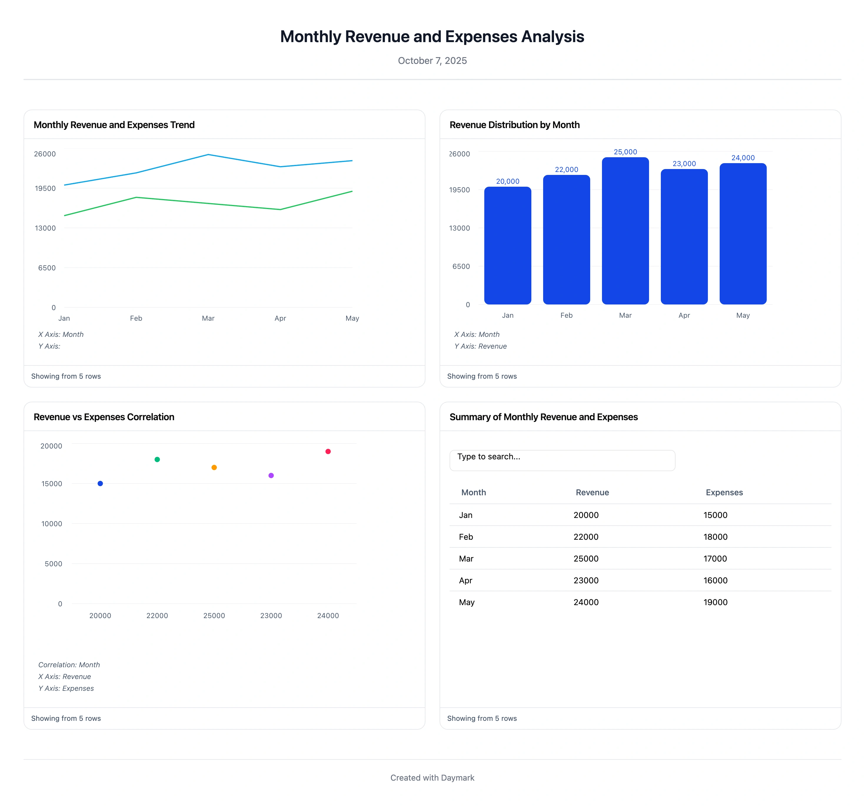
An analytics dashboard is a single screen that shows your most important metrics and KPIs in a visual, easy-to-read format.
It pulls data from different sources (databases, marketing tools, CRMs, product analytics, spreadsheets) into one place and turns them into charts, tables, and summaries. Many dashboards update in real time or on a schedule, so you always see fresh numbers.
A typical analytics dashboard might include:
- Website traffic and conversions
- Product usage and retention
- Sales pipeline and revenue
- Support volume and response times
Because everything is visual and centralized, people like executives, marketers, analysts, and product managers can quickly understand what is going on and make better decisions.
Dashboard KPI Benchmark Snapshot (Directional)
| Dashboard area | Common KPI pattern | What to watch first |
|---|---|---|
| Acquisition | sessions, channel mix, CAC | sudden traffic-quality shifts and CAC inflation |
| Conversion | conversion rate, funnel drop-off | largest stage-level leakage before scaling spend |
| Product | activation, retention, feature adoption | onboarding friction and cohort quality decline |
| Revenue | MRR/ARR trend, expansion, churn | growth quality versus contraction pressure |
| Operations | ticket volume, response time, SLA | service bottlenecks affecting retention |
Why Are Analytics Dashboards Important?
Analytics dashboards matter because they turn scattered data into clear, shared context.
1. Better and faster decisions
Dashboards translate complex data into simple visuals. Instead of digging through raw CSV files or multiple tools, teams can see what is working and what is not in a few seconds. It becomes much easier to spot trends, patterns, and issues.
2. Single source of truth
A dashboard centralizes data from different systems. Instead of everyone pulling their own reports, all stakeholders see the same up to date numbers in one place. This reduces confusion and time spent on manual reporting.
3. Real time or near real time visibility
When dashboards refresh continuously or on demand, you can react to what is happening right now. For example, a sudden drop in signups, a spike in error rates, or a surge in support tickets can be spotted early and addressed quickly.
4. Easier collaboration
Because dashboards are shared, teams can look at the same screen in a meeting and discuss next steps. This keeps conversations grounded in data, not opinions.
In short, analytics dashboards connect the data you already have to the decisions you need to make.
What Makes a Great Analytics Dashboard?
Not every dashboard is useful. The best ones feel obvious and intentional, not like a random collection of charts.
Here are the key traits of a great analytics dashboard:
-
Clear and simple The viewer should understand the big picture in a few seconds. Use clean layouts, clear labels, and avoid unnecessary visuals or metrics.
-
Connected to real goals Every metric should support a business question or objective. For example, a growth dashboard should focus on acquisition, activation, and retention, not vanity metrics that do not change decisions.
-
Up to date data Dashboards should reflect current or recent performance. Outdated data leads to bad decisions and erodes trust.
-
Interactive and filterable Filters for time, segment, country, plan, or channel let users explore data without asking for new reports. Drill downs help move from high level KPIs to the details behind them.
-
Consistent design Use consistent colors, chart types, and naming conventions. This lowers cognitive load and makes it easier to scan and compare metrics.
-
Actionable by design A great dashboard naturally leads to action. For example, clear indicators for a conversion drop or churn spike make it obvious where attention is needed.
When a dashboard has these qualities, it stops being a static report and becomes a tool people actually rely on every day.
Analytics Dashboard Examples (Common Use Cases)
You can build an analytics dashboard for almost any function or team. Here are some common types.
1. Marketing and web analytics dashboards
Designed for marketing and growth teams, these dashboards usually show:
- Traffic by source (organic, paid, social, referral, email)
- On site metrics (page views, sessions, bounce rate, time on page)
- Conversions (signups, demo requests, purchases)
- Campaign performance by channel, ad, or creative
They answer questions like:
- Which channels bring the most qualified traffic?
- Which campaigns convert best?
- Is website performance improving over time?
2. Sales and revenue dashboards
Sales and revenue dashboards help sales leaders, reps, and finance teams track:
- Total sales and revenue trends
- Pipeline value and stage progression
- Win rates and lead conversion rates
- Average deal size and sales cycle length
They show whether you are on track to hit targets, which segments or regions perform best, and where deals tend to stall.
3. Product analytics dashboards
Product teams and SaaS companies use these dashboards to understand user behavior and product performance:
- Daily, weekly, and monthly active users
- Feature adoption and usage frequency
- Activation and onboarding funnel performance
- Retention and churn over time
- Customer lifetime value (LTV)
They answer questions like:
- Which features drive engagement?
- Where do users drop off during onboarding?
- Are new users sticking around after 7 or 30 days?
4. Customer support dashboards
Support and customer experience teams track:
- Ticket or conversation volume
- First response time and resolution time
- Resolution rate by issue type
- Satisfaction scores such as CSAT or NPS
These dashboards help teams spot spikes, keep SLAs in check, and see common issue themes so they can fix root causes.
5. Executive or company overview dashboards
Leaders often use high level dashboards that combine metrics across:
- Revenue and growth
- Acquisition and funnel performance
- Product usage and retention
- Costs and profitability
These dashboards act as a simple health check for the whole company.
How to Create an Analytics Dashboard
Building a useful dashboard is easier if you follow a clear process.
Step 1: Define the purpose and audience
Start with two questions:
- Who is this dashboard for?
- What decisions should it help them make?
For example:
- Marketing managers who need to track campaign performance
- Product teams who need to monitor engagement and retention
- Founders who want a weekly business overview
Write down the main questions your dashboard should answer. This will keep it focused and stop it from becoming a random wall of charts.
Step 2: Choose the right KPIs
From those questions, list the key metrics that really matter. Then cut that list down.
Good KPIs are:
- Directly tied to your goal
- Easy to understand
- Something you are willing to act on
For example, a product engagement dashboard might include:
- Daily active users
- Activation rate
- Key feature usage
- 30 day retention
You do not need every metric your analytics tool can produce. Focus beats volume.
Step 3: Gather and prepare the data
List the data sources you will need, such as:
- Web analytics
- Product analytics
- CRM and sales tools
- Billing or subscription tools
- Data warehouse or database
Then:
- Connect to those sources through your dashboard or BI tool
- Clean and standardize the data
- Agree on metric definitions across teams
A dashboard is only as trustworthy as the data behind it, so it is worth getting this part right.
Step 4: Pick an analytics dashboard tool
Next, choose where you will build the dashboard. Options range from no code tools to full business intelligence platforms.
You might consider:
- Daymark for quick, no code analytics where you can ask questions in plain English and get charts and dashboards without writing SQL.
- Tableau or Microsoft Power BI for more advanced, enterprise level BI.
- Google Looker Studio for free, browser based reporting, especially for marketing and web analytics.
Pick a tool that fits your data stack, budget, and team skill level. If you want to avoid heavy setup and engineering work, a no code tool is often the easiest starting point.
Step 5: Design and build the dashboard
Now turn your KPIs into a clear layout.
- Put the most important metrics at the top.
- Group related metrics into logical sections, such as Acquisition, Engagement, Revenue, Support.
- Use chart types that match the data. For example, line charts for trends, bar charts for comparisons, funnel charts for steps in a process.
- Add filters for date range, user segment, country, or plan where it makes sense.
Ask yourself:
- Can a new user understand this in under a minute?
- Does the story of the data feel obvious?
If the answer is no, simplify.
Step 6: Test, refine, and iterate
Share the dashboard with real users and collect feedback:
- What do you look at most often?
- What feels confusing or unnecessary?
- Is there a key question that is still hard to answer?
Use this feedback to:
- Remove or move unused charts
- Rename metrics and sections for clarity
- Add or adjust filters
- Update KPIs as your goals evolve
A great dashboard is not a one time project. It is something you improve over time as your product and business change.
Common Analytics Dashboard Challenges
Even with a good tool, dashboards can fail if they are not planned well. Here are some common problems and how to avoid them.
-
No clear objective
Problem: The dashboard looks busy but does not answer a specific question.
Solution: Define a primary purpose, like “help the growth team monitor acquisition and activation”, and remove any metric that does not support that purpose.
-
Information overload
Problem: Too many charts and numbers on one screen, so users feel overwhelmed and do not know where to look.
Solution: Limit each dashboard to a focused set of KPIs. Create separate dashboards for different themes if needed, for example Acquisition, Product, Revenue.
-
Unreliable or inconsistent data
Problem: Numbers look wrong, do not match other reports, or are out of date.
Solution: Invest in data quality. Clean and validate data, agree on metric definitions, and set up predictable refresh schedules. Document how each metric is calculated so everyone shares the same understanding.
-
Low adoption
Problem: Dashboards exist, but people still ask for manual reports or do not log in.
Solution:
- Design for the real end user, not for a generic analyst.
- Involve users in the design process.
- Run short demos that show how the dashboard can replace their manual work.
Users will adopt dashboards that clearly save time and help them do their jobs better.
Analytics Dashboard Implementation Checklist
- Define one owner and one decision cadence for each dashboard.
- Limit each dashboard to a focused KPI set tied to a clear objective.
- Document metric formulas and sources directly in dashboard notes.
- Set alert thresholds for major KPI movements.
- Include one drill-down path per top-level KPI for root-cause analysis.
- Review monthly for chart bloat and stale metrics; remove unused blocks.
Conclusion
Analytics dashboards turn raw data into clear, actionable insight. When they are focused, trustworthy, and easy to use, they help marketers optimize campaigns, product teams improve user experience, sales teams hit targets, and leaders steer strategy with confidence.
To create a great analytics dashboard:
- Start with a clear purpose and audience
- Choose a small, meaningful set of KPIs
- Connect clean and reliable data
- Use a tool that matches your team and stack
- Design for clarity and action
- Treat the dashboard as a living product and keep refining it
If you want to move quickly without heavy BI setup, tools like Daymark make it possible to go from question to dashboard in minutes using natural language.
Done right, an analytics dashboard becomes more than a report. It becomes the daily compass that keeps your team aligned, focused, and truly data driven.
Frequently Asked Questions (FAQs)
What is an analytics dashboard?
An analytics dashboard is a visual interface that consolidates KPIs and metrics from multiple data sources into one view, often in real time, so teams can monitor performance at a glance and make data-driven decisions.
Which KPIs should I include on my dashboard?
Select KPIs that directly align with your goal and audience. For example, a marketing dashboard might track traffic sources, conversion rate, and CAC; a product dashboard might track DAU/WAU/MAU, retention, and feature usage. Keep it focused and actionable.
Which tools can I use to build dashboards?
Options range from no-code tools like Daymark (ask in natural language) to enterprise BI like Tableau and Microsoft Power BI, and Google Looker Studio for marketing/web. Choose based on ease of use, integrations, cost, and collaboration needs.
How often should a dashboard update?
Update frequency should match the decision cadence: real-time or hourly for operational monitoring, daily for team performance, and weekly/monthly for strategic views. Ensure data freshness is clearly communicated to users.
What are common mistakes to avoid?
Overloading with too many metrics, using outdated or inconsistent data, unclear labeling, and lack of a defined objective. Keep it simple, goal-aligned, and ensure data quality. Provide context and definitions for key metrics.